What didn't I expect? No way to know yet. I still don't expect it.
Surprised
Political Cartoon
Here we have a political cartoon. It's got all the hallmarks I expect. If you think you're reading any sort of comprehendible political message from it... please explain it to me. Maybe... France is using your taxes to cannibalize your rights? I just threw random words on this nonsense image.
Grey Greeting
Deep Holler (Remake)
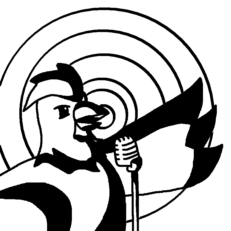
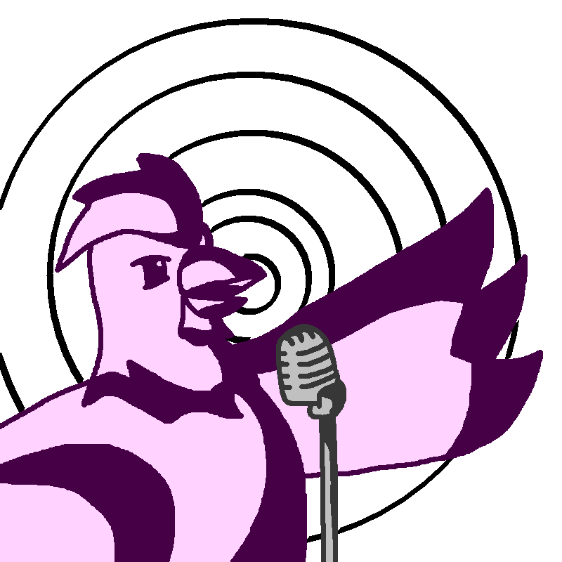
Here we have a rare remake for one of my older pieces, titled Deep Holler. The changes are mostly just correcting proportions, cleaner linework and adjusting the framing. The microphone was an addition from the requestor, but it gives a bit more depth to the whole image. The soundwave/spiral has a slightly warped/stretched quality, which I think gives it more impact compared to the precise ones in the original. Anyways, like I said on the original, it's not that deep.
I would often like to circle back since I think I've improved a lot over the years, but it's hard to know what a good thing to remake it since looking back on the site is just a combination of nostalgia and grimacing at my older pieces. I didn't have to think for this one though because this was a special request from one of my Patreon supporters. Thank you to Michael for the request.
It wasn't exactly part of the remake request, more just a step in the process, but I have a version with the elements in separate colors which I like the look of.
Striking Outline
Single Stroke 2
I made several attempts at drawing a chicken in a single click. I'm not sure why the older ones are so rough though. I didn't spend that long on this one.
On that note the image I have called "Single Stroke" doesn't actually appear to be on this site, which is probably fine as it's quite bad.
Logo and Branding 2020
This is the new and official ChickenMaker.net logo and brand guidelines. (For my personal use obviously. I don't know who else thinks we have a brand.) This should probably have been posted before I updated the site since this is already around.
The new logo is based off the previous concept scrap. I used clean simple shapes and adjusted the angle on the paintbrush. We have clear and recognizable line work, which shows includes both the chicken and drawing aspects of the site. For the full color variant we have added the partially colored white body. Body left we have a two tone version, where we fill most of the enclosed sections. I also set up a vector version, which you can see on the top of the sidebar, something I previously didn't have.
We have a pretty generic uppercase text, though it is hand drawn. For the text you can just kind of split and orient it any way that seems convenient, including Chick–Enmak–Er.Net, whatever that means. Try to align the left edge. Displaying the logo and site name should follow the purple layout on the bottom left, with the text in an "L" shape. It isn't that way in the site banner because that's wide.
Our brand colors are still primarily the shade of lavender which has been the site background ever since the site stopped being lime green. The primary color is mainly used for large background elements and content on dark backgrounds. The dark purple is for outlines and content on light backgrounds, along with backgrounds for light text. Black text is preferred. The light purple on the sidebar isn't a brand color.
Primary Color: #C694FC
Dark Color: #6728B2
Accent Color: #B56AFF
Walker
Not a great animation, but I wanted to get a little 4-5 frame walk.
I should really move more than just the feet, but it's too exaggerated with this design.
Logo Concept Scrap
Silhouette Stack
I considered a rainbow, but I thought maintaining a single hue would be better.
Line Art Set


Okay, I said I was making a set of 4 the other day. So far so good. I think I like all 4 of these, but I'm not sure about this first one. It feels a bit too boring, but it's kind of the fundamental Chicken Maker chicken so I'll probably keep it. I need to play with finishes and the like on the coasters still.
Virtual Pet
Ocean Eyes
Black White Balance
Coloring Chicken Maker
Anyways I always look forward to seeing some feedback when I post something like this so let me know what you think in the comments or on one of the social medias.
 |
| Cover |
 |
| Faces |
 |
| Sun |
 |
| Moon |
 |
| Tough |
 |
| Duo |
 |
| Music |
 |
| Mountain |
 |
| Aura |
 |
| Stained Glass |
Same Chicken Post #8 (2016 Chicken Maker Style, Line Art Style)
A Bang
I also did this in color, but I think I prefer the line art. Um... That one will be posted on the Patreon.
Crossing
This piece is pleasantly pastel, in contrast to those words I just wrote.
Digital Pilot
This is, I believe, the most detail I have tried to render using my "Gritty Sharpness" style of black and white cel-shading-esque art. How did it work?


