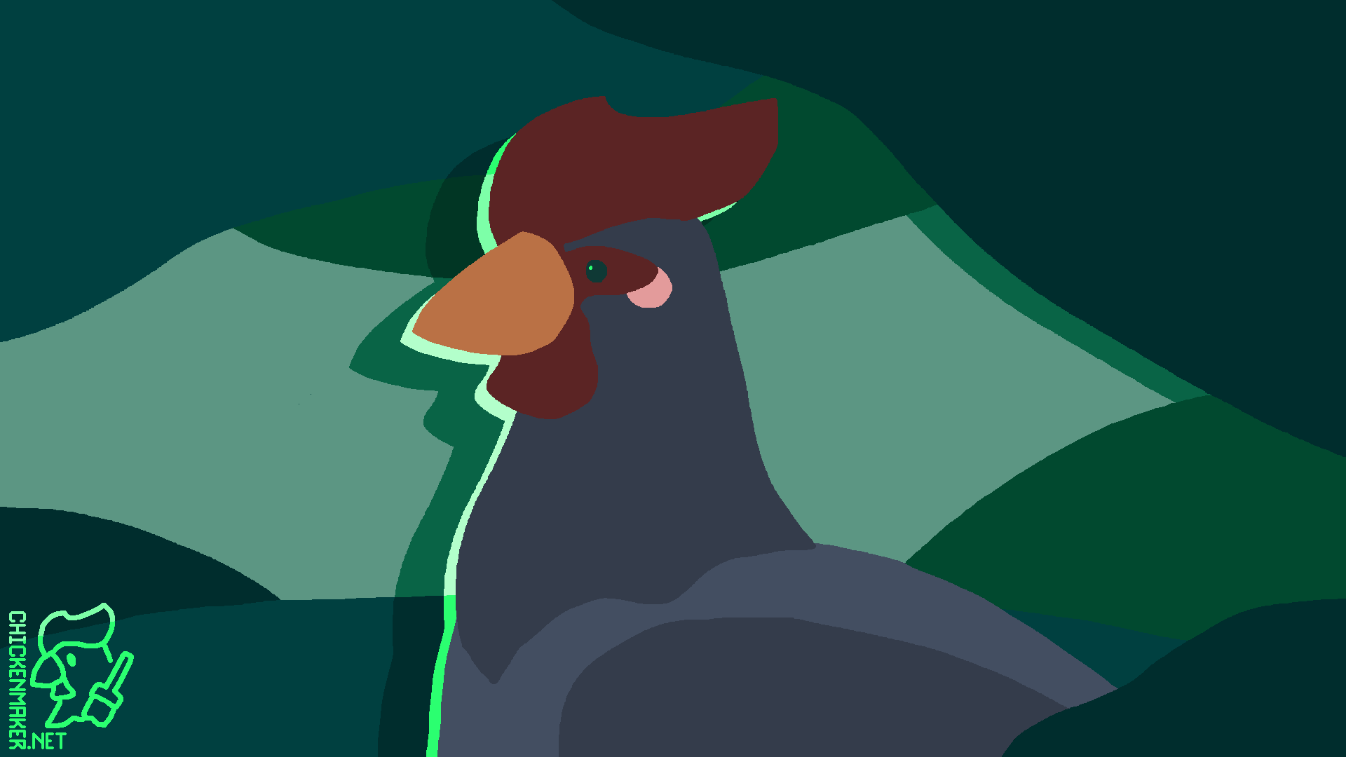
The chicken glows with an eerie power. The background is a mixture of dull blue-greens, while the chicken itself used a standard, but not oversaturated, blue-gray color scheme. The flat colors and limited palette let the bright colored 'shadow' pop. Using a hard shadow rather than a glow for the "aura" helps to maintain a sense of dimension in the piece.
Special thanks, as always, to my Patreon supporters. Get over there and give me a dollar?


No comments:
Post a Comment